Documented extraction processes for each major content format. Built around examples, not abstractions.
Source analysis. Format requirements. The extraction steps. A worked example using a real article type. Then notes on what to watch for — the parts where most people get the format wrong.
Frameworks are organized by output format, not by source type. You start with the format you need to produce, then work backward to understand what to pull from the source.
A well-researched article contains multiple distinct arguments, each capable of standing alone. This framework identifies those arguments systematically and rebuilds each as a native LinkedIn post — with a format-appropriate hook, a clear narrative arc, and a closing that invites engagement without demanding it.
Read through the article and pull out every distinct assertion. Each is a potential post seed. Most articles have between six and ten, though shorter pieces may have fewer. Do not evaluate them yet — just list them.
LinkedIn audiences respond well to counterintuitive insights, process revelations, and professional lessons. Score each claim on those three dimensions. The top five become your posts. Skip anything too technical, too niche, or that requires the full article context to make sense.
LinkedIn posts live or die on their first two lines — the text that appears before the "see more" break. Write the hook as a standalone sentence that creates tension or presents a contradiction. The body resolves it. This structure is consistent across all five posts.
Most LinkedIn posts lean on bullet lists. Native-feeling posts that perform consistently tend to use short paragraphs with one idea each. The claim from the article becomes a story or a sequence. Lists work for instructional content — for insights, narrative outperforms.
LinkedIn's algorithm rewards comment engagement. A genuine question — one you actually want the answer to — performs better than "what do you think?" or "have you experienced this?" Be specific. The question should follow logically from the post's argument.
Source article: "Why Most Editorial Calendars Fail Before the First Month." The article contains seven distinct claims. After scoring, the top five are: (1) the planning horizon mismatch, (2) the single-author bottleneck, (3) the format-agnostic approach, (4) the publication-first mindset, and (5) the measurement gap. Each becomes a post. The planning horizon post opens: "Most editorial calendars fail because they are planning documents pretending to be publishing systems." The rest of the post unpacks that tension. The question at the end: "What is the longest your team has consistently followed a content calendar before it collapsed?" The other four posts follow the same structural logic with different opening tensions.
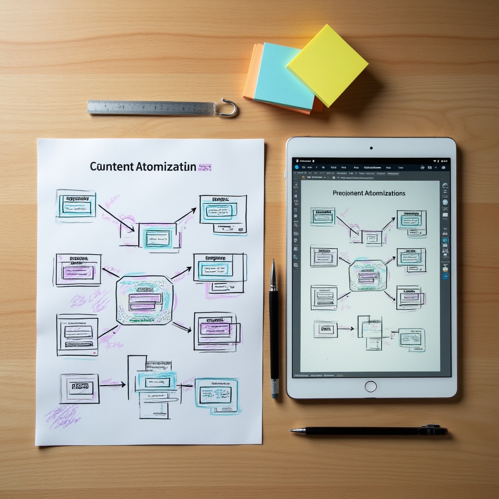
A newsletter is not a summary of your article. It is a complete reading experience delivered to an inbox, where the reader has opted in for editorial voice and contextual depth. This framework extracts one section of a longer piece and expands it into a self-contained newsletter issue — with its own opening, its own context-setting, and its own conclusion.
Not the most important section — the one with the most texture. The section where you had the most to say, where the argument was most nuanced, or where you cut content for length. That section has the most to give in a newsletter format.
Newsletter subscribers may not have read the original article. The opening paragraph needs to establish the topic, its relevance, and the perspective you are bringing — without referencing the original piece at all. Write it as if the original does not exist.
Articles often compress nuance for length. In the newsletter, restore that nuance. Add the example you cut. Develop the counterargument you dismissed in one sentence. The newsletter reader is expecting depth — the format rewards it.
Newsletter closings that perform well tend to end with an observation or a question that lingers. A link to the full article can appear in a postscript, but it should not be the structural destination of the piece. The newsletter should be complete without it.
Audio listeners cannot re-read a sentence. They cannot skim. They follow a linear experience and process information in real time. This means written structure — which often relies on headings, visual hierarchy, and the ability to scan — fails almost completely when read aloud. The podcast script is not a read-aloud of the article. It is a different document that carries the same research.
Every heading in the article becomes a spoken transition. "Now I want to talk about..." or "Here is where it gets interesting..." These verbal signposts do the work that visual hierarchy does on a page. They are not optional — without them, audio listeners lose orientation quickly.
Written prose can sustain complex sentence structure because readers can pace themselves. Spoken word cannot. Every sentence in the script should be speakable in one breath. Complex ideas get broken across multiple short sentences. Read it aloud as you write it — if you run out of breath, rewrite it.
A written article can include a precise percentage. In audio, that number needs context immediately, in the same breath: "LinkedIn's own published data shows that document posts — that is, native PDF-style uploads — get significantly higher organic reach than posts that include external links. We are not talking about a marginal difference." The listener cannot check a footnote.
Podcast retention data consistently shows that episodes retain listeners when the first sixty seconds make clear exactly what question the episode answers. Not what topic it covers — what specific question it answers. Take the article's central argument and reframe it as a question the listener would actually ask themselves.
The first step in infographic extraction is deciding whether the content is actually visual. Arguments that depend on nuance, narrative flow, or contextual reading rarely work as infographics. Content with clear comparisons, sequential processes, or hierarchical structures translates well. This framework starts with that diagnostic before touching any design tool.
Does the article describe a sequence of steps? A comparison between two or more approaches? A hierarchy of concepts? Any of these structures translate directly to a visual format. Narrative arguments, opinion pieces, and nuanced analysis generally do not.
An infographic carries the structural logic of the content, not the explanatory text. Pull only the labels, the sequence numbers, and the core terms. If the infographic requires more than eight words per element to make sense, the content may not be ready for visual format — or the extraction needs to go deeper to find simpler underlying structure.
An infographic designed for Pinterest has different dimensions, density, and label size than one designed for a LinkedIn document post. Before touching layout, decide where the infographic will live — that determines every design decision that follows.
Publishing atomized content without a sequencing plan produces disconnected outputs that do not build on each other. This framework maps the outputs from a single research piece across a twelve-week calendar in a sequence designed to create narrative momentum — where each output references or extends the previous ones.